Forget the plane tickets, the packing, and the perpetual struggle for a decent beach umbrella. You want that blissful, toes-in-the-sand feeling right now, don’t you? I totally get it. We’ve all spent a small fortune on coastal-scented candles trying to trick ourselves into relaxation, but the real secret to instant vacation vibes is way simpler: it’s all in the walls, my friend.
You need to ditch the dusty old palette and bring the ocean right inside your house. We’re not talking about cheesy seashell borders here. We’re talking sophisticated, sun-drenched, coastal color combinations that make you feel like you accidentally booked a five-star resort just by sitting on your sofa. Are you ready to trade the commute for the Caribbean? Let’s dive in.
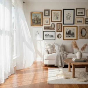
1. The Classic Escape: Crisp White & Navy Blue
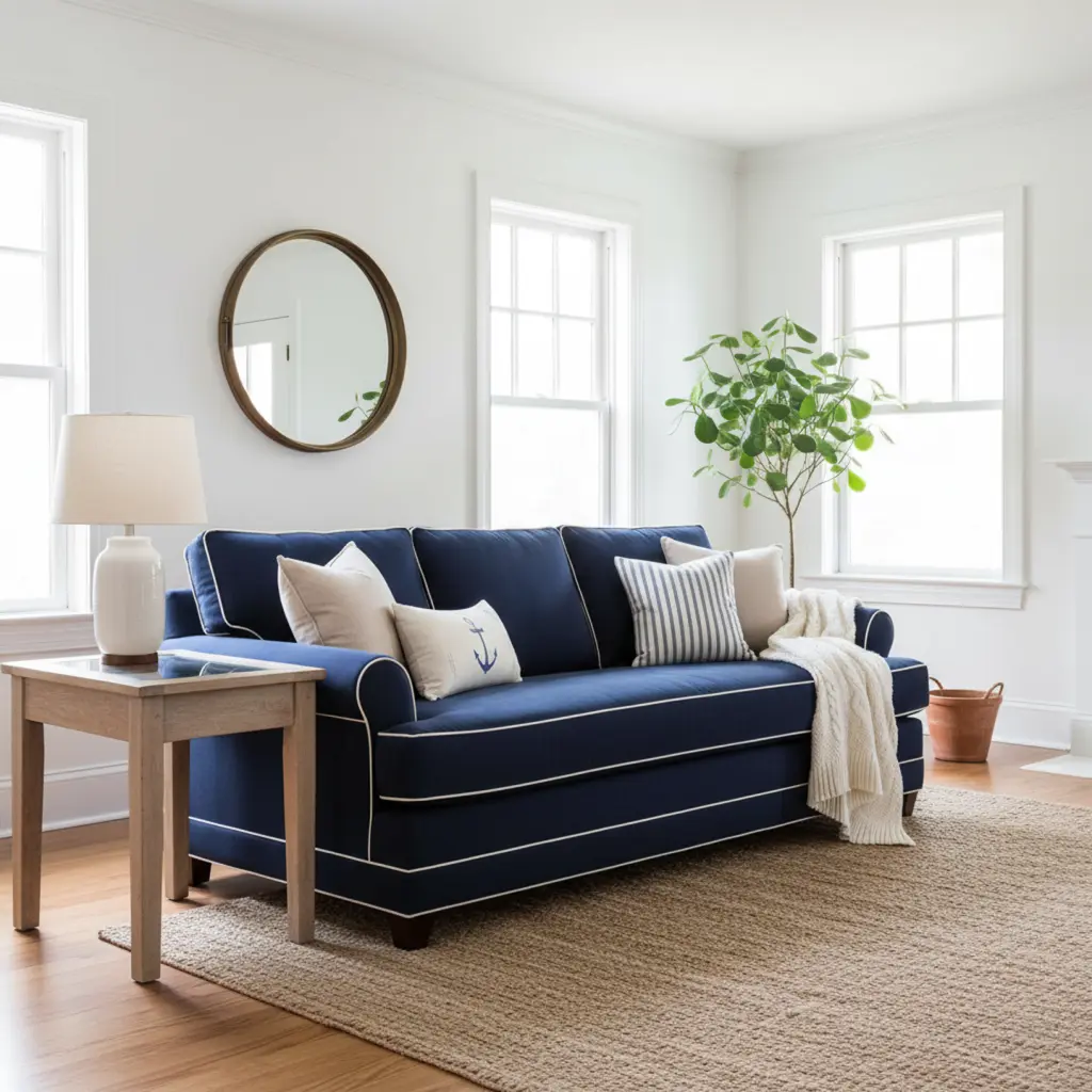
If you want a coastal look that never, ever goes out of style, you start here. This combination is the little black dress of coastal decor. It’s clean, it’s timeless, and it immediately says, “Yes, I own a sailboat, even if I really just bought the rug at Target.”
Why This Combination Works So Well
Navy blue provides the necessary gravity, anchoring the room just like the deep ocean anchors the horizon. The crisp white, and I mean super crisp, bright white, acts like the fresh salt air and fluffy clouds. This duo is essentially preppy perfection mixed with seaside relaxation.
I personally love using Navy on lower cabinets in a kitchen or on a statement wall behind a bed. You avoid making the room feel heavy by letting the white handle the vast majority of the wall space. IMO, painting an entire small room navy blue is a recipe for a panic attack, not relaxation.
- Navy Blue: Use it on textiles, throw pillows, and the back of built-in shelves.
- Crisp White: Select a white with no strong undertones, think “Extra White” or “Decorator’s White.” This maximizes light reflection.
- Accent: Introduce small touches of natural wood tones (think teak or weathered oak) for warmth.
2. Sun-Bleached Driftwood: Greige & Sandy Taupe
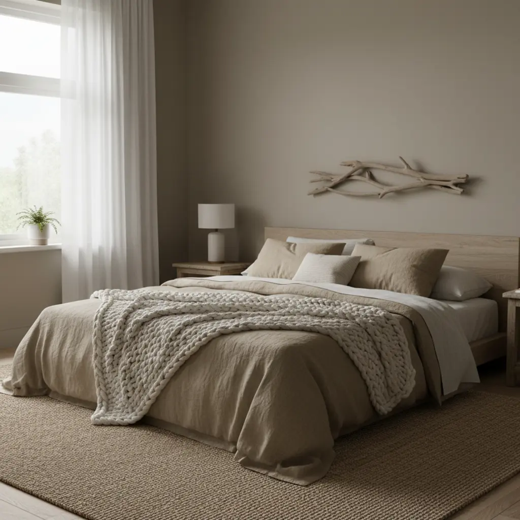
Want to skip the bright blues entirely and focus purely on the soft, weathered feeling of the beach after a long summer? Then you need the Sun-Bleached Driftwood palette. This combination captures the essence of sand dunes and smooth, grey driftwood washed up by the tide.
This aesthetic is perfect if you favor neutrals but hate the cold feeling pure grey brings. Greige, which is a magical blend of grey and beige, gives you the sophistication of grey without the chill. You pair Greige with a deep, sandy taupe, and suddenly, your living room feels expensive and cozy all at once.
Maximizing Texture in a Neutral Coastal Palette
Because you rely less on bold color, texture becomes your main character. You need rough linens, chunky knit throws, and rugs made of jute or sisal. My own living room uses this combo, and I swear the light changes better than it did with any other paint color.
- Greige Base: Paint your main walls in a warm greige; it’s the foundation of your sand.
- Sandy Taupe Accents: Use this deeper color on linen curtains or a velvet armchair.
- Metallics: Skip the shiny chrome! Stick to brushed gold or matte black fixtures to keep the look grounded and elegant.
3. Tropical Sunset Pop: Coral, Teal, & Cream
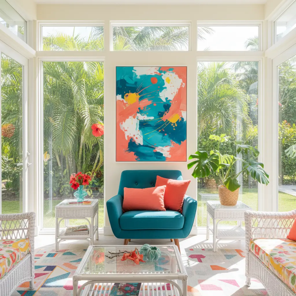
If you think “coastal” only means sad beige and pale blue, you need this wake-up call. The Tropical Sunset Pop combination is vibrant, energetic, and unapologetically fun. It’s what happens when the perfect Caribbean sunset meets the clearest lagoon.
Teal, the star of this show, acts as your beautiful blue water. You then introduce Coral as your dramatic pop of heat, think of it as the setting sun or the flash of a tropical fish. You keep Cream as your balancing white, preventing the whole thing from looking like a crayon box explosion.
Mastering the Coral & Teal Balance
The trick here is proportionality. You don’t paint the whole room coral. You use it in strategic, high-impact doses. Think a throw pillow, a piece of artwork, or the interior of a built-in bookshelf. FYI, Teal works beautifully as a headboard color; it’s vibrant but still incredibly soothing to sleep next to.
We use Teal as the dominant wall color in my guest bathroom, and it honestly makes everyone look amazing when they stand next to it. Who doesn’t want that kind of decorating trick?
- Dominant Teal: Use a muted teal on large surfaces to represent deep water.
- Coral Pop: Reserve coral for accent pieces that you can easily swap out.
- Cream Grounding: Use cream on trim and ceilings to keep the vibrancy contained and sophisticated.
4. Modern Nautical Chic: Charcoal Grey & Bright White
If the classic Navy and White felt a little too “Cape Cod grandma” for your tastes, then welcome to the modern era. We swap the Navy for Charcoal Grey, and suddenly, the whole aesthetic feels urban and cool, while still being totally coastal.
Charcoal Grey brings a sleek, sophisticated edge that mimics the look of modern maritime structures or storm-tossed seas. When you pair this deep, matte grey with stark, architectural white, you achieve a sharp contrast that designers live for. This combo says you enjoy the ocean view, but you also have a gallery wall and an espresso machine.
The Power of Monochromatic Coastal Accents
The brilliance of this combination lies in its simplicity. You don’t need a lot of kitschy decor. Stick to clean lines, minimalist furniture, and perhaps a single black-and-white photograph of crashing waves.
- Charcoal Base: Excellent for feature walls or a large sofa. It absorbs light beautifully.
- Bright White: Use this for all furniture and trim to provide maximum contrast and keep the room light.
- Single Pop: If you must add color, use a single pop of Emerald Green (like one large plant) to simulate the deep contrast of the water’s edge.
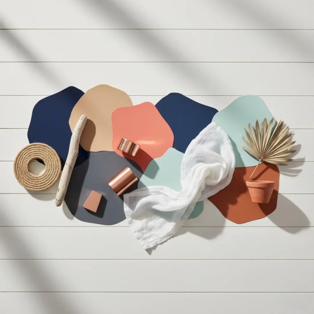
5. Deep Sea Drama: Marine Blue, Sand, & Copper
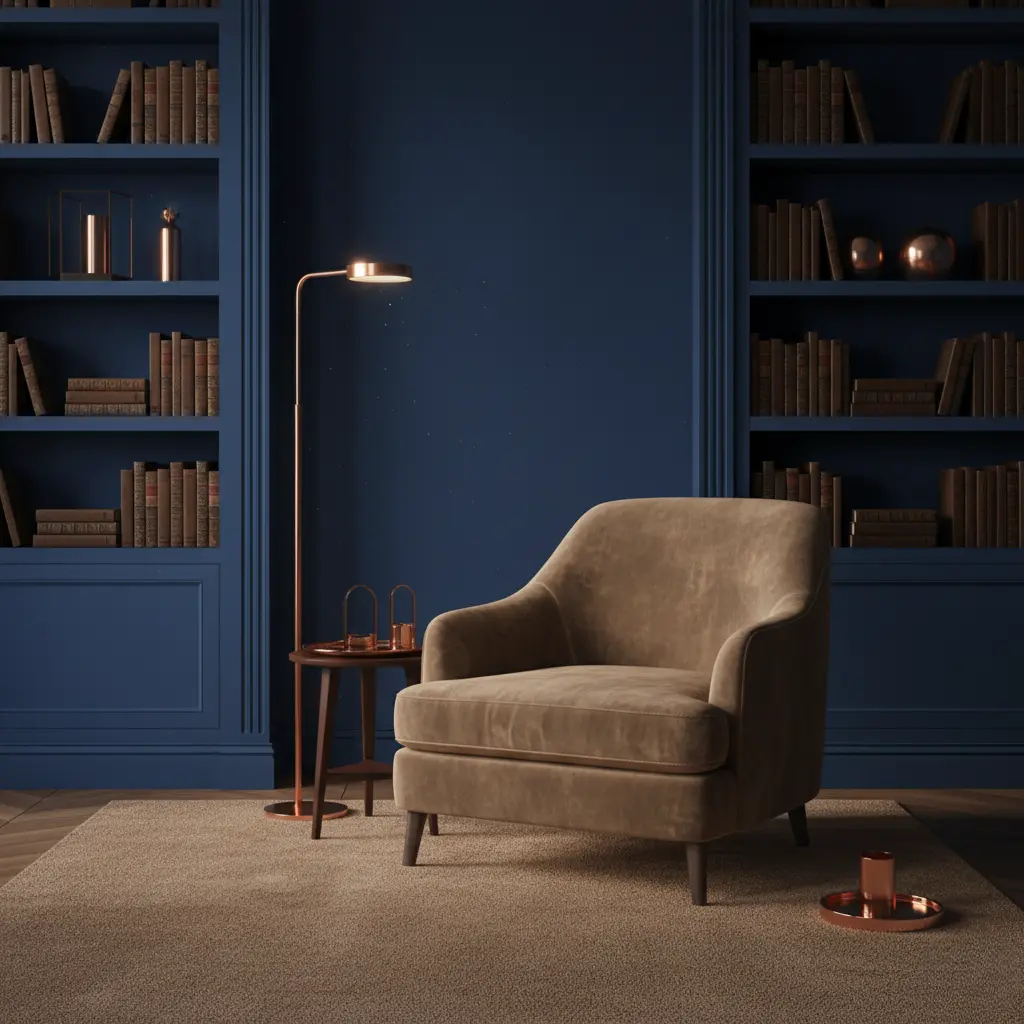
Looking for a coastal palette that feels moody, rich, and unexpected? Deep Sea Drama is your answer. This palette skips the typical beach fluff and heads straight for the mysterious, unexplored depths of the ocean.
You base this look on a rich, saturated Marine Blue, think jewel-toned navy or Prussian blue. You then use a muted, dark Sand color for relief. The absolute key here, however, is the accent color: Copper. The warm metallic shine of copper mimics the sunken treasure or the glow of sunlight trying to reach the seabed.
Making Metallic Coastal Work
You might wonder if copper and coastal decor mix. They totally do! Copper is used for piping, ships’ bells, and old navigation tools. It provides a historical, antique feel to the modern, saturated blue.
I find this combo works best in rooms with tons of natural light. If your room is small and dark, you might end up feeling like you actually live inside a whale (which, for the record, is not the goal).
- Marine Blue: Use this as your primary paint color on the majority of the walls.
- Sand Tone: Reserve the sand color for large, grounding pieces like a linen sofa or a rug.
- Copper Accents: Use this metal on lamps, small frames, or cabinet pulls. It adds necessary luxury.
6. Sandy Toes & Sea Glass: Pale Aqua, Beige, & Lime Green
This is the gentlest, most serene version of coastal living. It perfectly captures that moment you look down at the sand and see a perfectly smooth, frosted piece of sea glass glinting in the light. It’s pure tranquility, distilled.
You start with a foundation of soft, airy Beige, which is your fine, dry sand. You then layer in Pale Aqua, the gentle color of shallow water just before it hits the shore. The final touch, which differentiates this look from being too washed out, is a tiny dash of Lime Green to represent the algae and life at the water’s edge.
The Tranquil Power of Pale Aqua
Pale aqua is a color that visually slows your heart rate. It’s perfect for bedrooms, bathrooms, and sunrooms where true relaxation is the only goal. When pairing it with beige, make sure the beige has a slightly pink or yellow undertone to keep it warm, not muddy.
- Beige Base: Use a light beige paint as the primary wall color.
- Pale Aqua: Introduce this color through bedding, light sheer curtains, or wall art.
- Lime Green Pop: Use sparingly! Think small succulent planters or an abstract painting. Less is definitely more here.
7. Mediterranean Breeze: Terracotta & Stone White
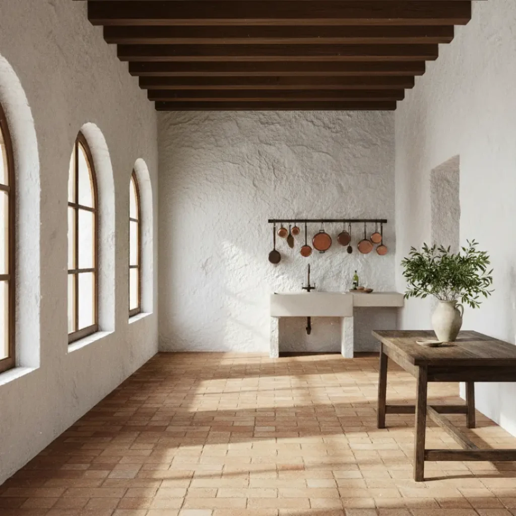
Ready to transport yourself from Cape Cod straight to Santorini? Then you ditch the New England vibes and embrace the bright, earthy tones of the Mediterranean. This combo is Coastal Decor for the person who also owns a lot of olive oil and enjoys a sun-drenched siesta.
You pair a bold, rustic Terracotta, the color of ancient roof tiles and sun-baked earth, with a bright, textured Stone White. The contrast is stunning: the terracotta provides the grounded warmth, and the white brings the blinding brilliance of the Greek coastline.
Bringing Earthy Tones to the Shore
This aesthetic relies heavily on texture. You need plaster-like walls (even if it’s just textured paint) and rough-hewn wooden beams (or beam-like furniture). It’s less “sailing” and more “sipping wine on a cliffside veranda.”
The Terracotta is your statement. You can use it on a floor tile, or even just paint the interior of an arched doorway or niche.
- Terracotta: Use for flooring, large ceramic planters, or as a strong accent color.
- Stone White: This white should have a subtle texture to it, suggesting stucco or plaster.
- Accents: Bring in deep forest green (olive branches) and natural leather accents for authentic warmth.
Pro-Tips for Coastal Color Execution
Choosing the colors is only half the battle. You need to execute them like a pro so your room looks sophisticated, not themed. Here are a few tricks I learned the hard way (and yes, that involved painting a wall twice. Don’t judge):
Layering Texture is Non-Negotiable
Coastal design is defined by its materials as much as its colors. You must mix up your textures, or the room will feel flat.
- Rugs: Use jute, sisal, or wool that mimic rope or sand.
- Window Treatments: Choose light, sheer linen or cotton to filter light beautifully. Never use heavy velvet curtains.
- Furniture: Combine woven rattan or wicker with smooth, painted wood surfaces.
The 60-30-10 Rule Saves Your Sanity
Ever wondered why those magazine rooms always look perfect? They use the 60-30-10 rule. It’s the interior design rule that is actually worth following, IMO.
- 60% Dominant Color: Your main neutral (White, Beige, Greige). Use this on most walls.
- 30% Secondary Color: Your coastal color (Navy, Aqua, Teal). Use this on furniture and one accent wall.
- 10% Accent Color: Your fun pop (Coral, Copper, Lime Green). Use this on small accessories, art, and throws.
Don’t Forget the Lighting
Coastal rooms require bright, natural light. Maximize the light you have with sheer curtains. Use warmer-toned light bulbs (2700K to 3000K) to give the illusion of perpetual sunset. Cold, blue-white lighting (5000K+) can make your beautiful aqua look harsh and surgical. Don’t do that to yourself!
Conclusion: Vacation Awaits
We’ve covered everything from Classic Navy to Mediterranean Terracotta, and I’m honestly ready to buy a new paint sample right now. The best part about these coastal color combinations is that they offer more than just aesthetics; they offer an escape. You create a visual palette that taps into deep, calm memories of the ocean, sand, and sun.
You don’t need a beach house to get the beach feeling. You just need the right attitude and, frankly, the right paint. So grab a sample, try out that Deep Sea Drama, and watch your home immediately trade “stressed” for “sun-kissed.” Now, if you’ll excuse me, I think I hear the tide coming in (it’s actually just my washing machine, but a girl can dream, right? 😉).